| border | Used to set border | border?: string, |
| borderRadius | Used to set border radius | borderRadius?: string; |
| background | Used to set background colour | background?: string; |
| height | Used to set height | height?: string; |
| width | Used to set width | width?: string; |
| boxShadow | Sets shadow effects around the element | boxShadow?: string; |
| groupTypeTextFont | Sets the font style of the text indicating group types | groupTypeTextFont?: string; |
| groupTypeBorder | Sets the border style for group type indicators | groupTypeBorder?: string; |
| groupTypeBorderRadius | Sets the border radius for group type indicators | groupTypeBorderRadius?: string; |
| groupTypeTextColor | Sets the color of the text indicating group types | groupTypeTextColor?: string; |
| groupTypeTextBackground | Sets the background color for text indicating group types | groupTypeTextBackground?: string; |
| groupTypeBackground | Sets the background color for group type indicators | groupTypeBackground?: string; |
| groupTypeBoxShadow | Sets shadow effects around the group type indicators | groupTypeBoxShadow?: string; |
| activeGroupTypeTextFont | Sets the font style of the text indicating active group types | activeGroupTypeTextFont?: string; |
| activeGroupTypeTextColor | Sets the color of the text indicating active group types | activeGroupTypeTextColor?: string; |
| activeGroupTypeBackground | Sets the background color for active group type indicators | activeGroupTypeBackground?: string; |
| activeGroupTypeBoxShadow | Sets shadow effects around the active group type indicators | activeGroupTypeBoxShadow?: string; |
| activeGroupTypeBorderRadius | Sets the border radius for active group type indicators | activeGroupTypeBorderRadius?: string; |
| activeGroupTypeBorder | Sets the border style for active group type indicators | activeGroupTypeBorder?: string; |
| groupTypeTextBoxShadow | Sets shadow effects around the group type indicators container | groupTypeTextBoxShadow?: string; |
| groupTypeTextBorderRadius | Sets the border radius for the container of group type indicators | groupTypeTextBorderRadius?: string; |
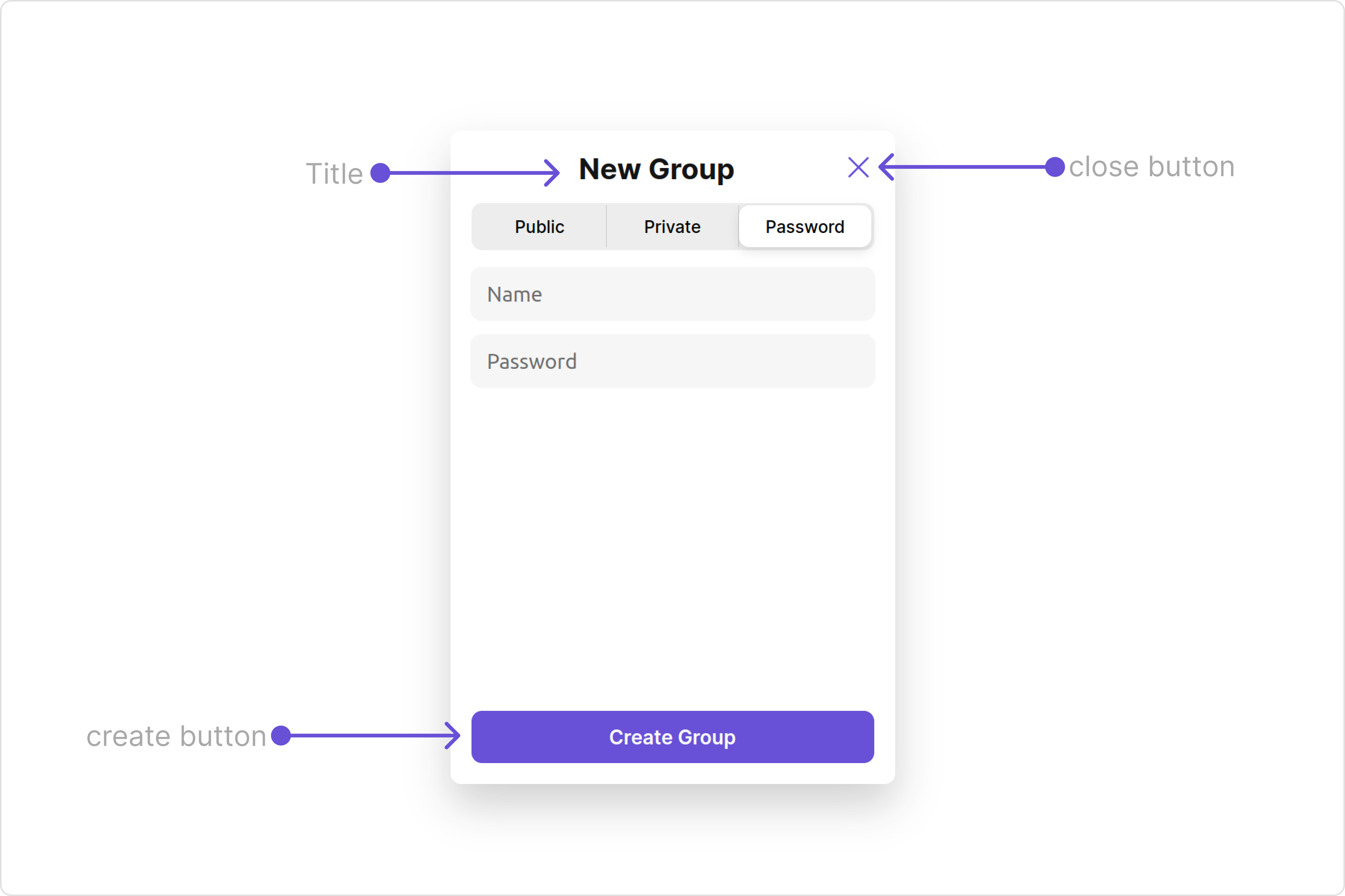
| closeIconTint | Sets the color of the close icon | closeIconTint?: string; |
| titleTextFont | Sets the font style for the title text in the app bar | titleTextFont?: string; |
| titleTextColor | Sets the color for the title text in the app bar | titleTextColor?: string; |
| errorTextFont | Sets the font style for error messages | errorTextFont?: string; |
| errorTextBackground | Sets the background color for error messages | errorTextBackground?: string; |
| errorTextBorderRadius | Sets the border radius for error messages | errorTextBorderRadius?: string; |
| errorTextBorder | Sets the border style for error messages | errorTextBorder?: string; |
| errorTextColor | Sets the color for error messages | errorTextColor?: string; |
| nameInputPlaceholderTextFont | Sets the font style for placeholder text in the name input field | nameInputPlaceholderTextFont?: string; |
| nameInputPlaceholderTextColor | Sets the color for placeholder text in the name input field | nameInputPlaceholderTextColor?: string; |
| nameInputBackground | Sets the background color for the name input field | nameInputBackground?: string; |
| nameInputTextFont | Sets the font style for text in the name input field | nameInputTextFont?: string; |
| nameInputTextColor | Sets the color for text in the name input field | nameInputTextColor?: string; |
| nameInputBorder | Sets the border style for the name input field | nameInputBorder?: string; |
| nameInputBorderRadius | Sets the border radius for the name input field | nameInputBorderRadius?: string; |
| nameInputBoxShadow | Sets shadow effects around the name input field | nameInputBoxShadow?: string; |
| passwordInputPlaceholderTextFont | Sets the font style for placeholder text in the password input field | passwordInputPlaceholderTextFont?: string; |
| passwordInputPlaceholderTextColor | Sets the color for placeholder text in the password input field | passwordInputPlaceholderTextColor?: string; |
| passwordInputBackground | Sets the background color for the password input field | passwordInputBackground?: string; |
| passwordInputBorder | Sets the border style for the password input field | passwordInputBorder?: string; |
| passwordInputBorderRadius | Sets the border radius for the password input field | passwordInputBorderRadius?: string; |
| passwordInputBoxShadow | Sets shadow effects around the password input field | passwordInputBoxShadow?: string; |
| passwordInputTextFont | Sets the font style for text in the password input field | passwordInputTextFont?: string; |
| passwordInputTextColor | Sets the color for text in the password input field | passwordInputTextColor?: string; |
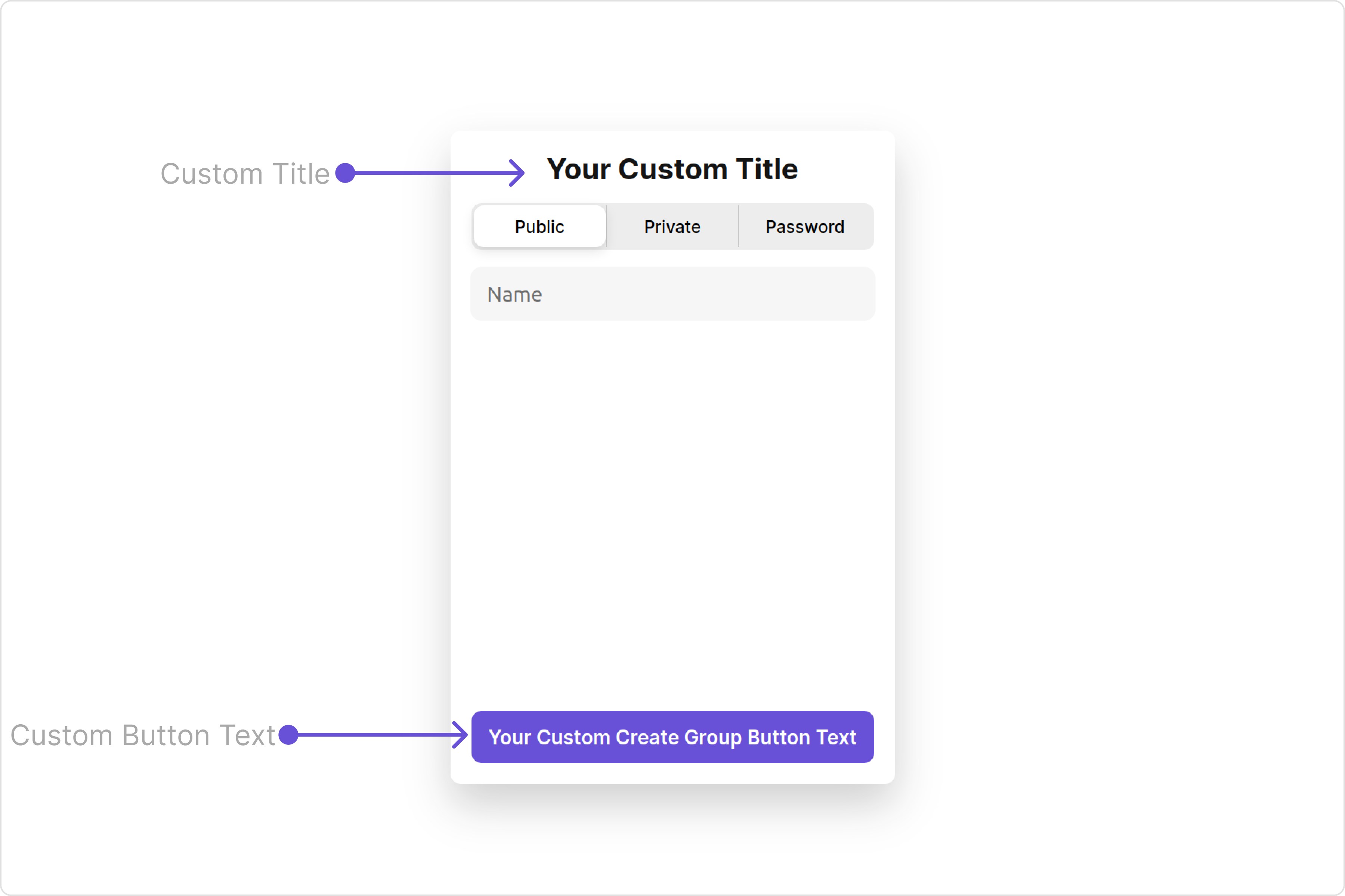
| createGroupButtonTextFont | Sets the font style for text on the create group button | createGroupButtonTextFont?: string; |
| createGroupButtonTextColor | Sets the color for text on the create group button | createGroupButtonTextColor?: string; |
| createGroupButtonBackground | Sets the background color for the create group button | createGroupButtonBackground?: string; |
| createGroupButtonBorderRadius | Sets the border radius for the create group button | createGroupButtonBorderRadius?: string; |
| createGroupButtonBorder | Sets the border style for the create group button | createGroupButtonBorder?: string; |